Shading Rocks and Stones
Inkscape Tutorial
How to create rocks and stones? Why does my shading look like clouds? These were some of the questions posted. I came up with a few options to shade stone in Inkscape. Resulting in, what I hope is a helpful tutorial. I wrote a basic tutorial on shading earlier that might be helpful as well.
(I am still reworking the space tutorial. It’s not been forgotten.)

Let’s get started…
with a simple rounded rock, pebble, boulder, whatever you want to call it.
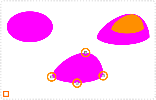
Let’s start with a circle.
Convert it to a path and move the lower nodes in and make the side ones to corners.
Create a copy and scale it down for the lighter shade of the rock.
Colour the rock shapes and use the interpolate to create a smooth gradient. (Extension/ Generate from Path/ Interpolate)
The higher the step count the smoother the ‘gradient’.
Add a lighter copy of the small shape with gradient transparency for more highlight…
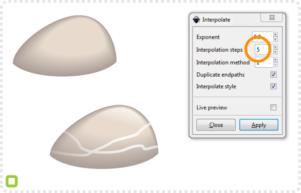
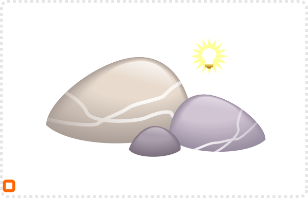
and some lines as veins to make it visually more interesting.
When creating a group of rock keep the direction of the light in mind.
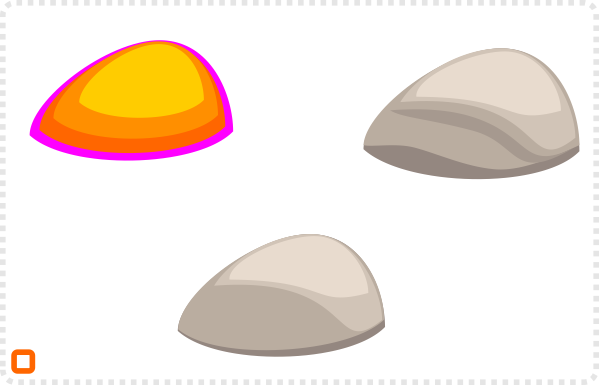
Another way to shade the rock is by using less shapes for harsher edges.
Deform the inner shapes to form some roundness.
Adding another shadow shape to give the edge more depth.
Note:
For the veins I used the freehand draw tool, with a white stroke that I ended up putting into a clip to match the shape of the pebble.


Duplicating and scaling the rock allows for easy variations. By adding darker shades or colour the look of the rocks can change dramatically.
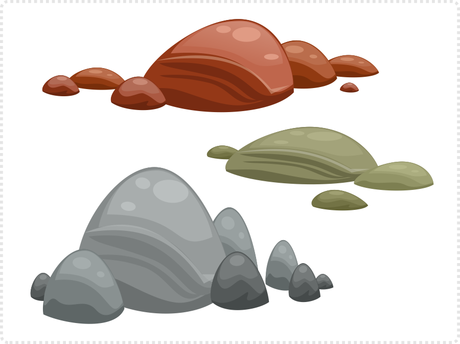
I used the same shapes in different colours and scaling and rearranged them to form unique groups.

When working with outlines in your art style, add an outline to the biggest shape. Colour it darker than the shadow shape.

Rock Shape Variations
Another shape commonly used for rocks is a lot more edgy and clear cut. I worked mainly with the straight line tool for this one. The shading of the rocks and stones is mainly done with transparent gradients. You can also start with the square, make it a path and add nodes to it, if you find that approach easier.
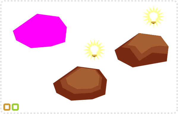
Using the straight line draw a rough boulder shape.
Colour it and make two smaller and lighter duplicate copies.
Define the light direction and move the lighter shapes accordingly. Adjust the nodes to create a lighter top and darker sides.
Add more shapes for added detail.
Create the highlights at the top and at the edge using the straight line tool.
Shading the elements is easiest by choosing a lighter/ darker colour and adjusting the opacity.
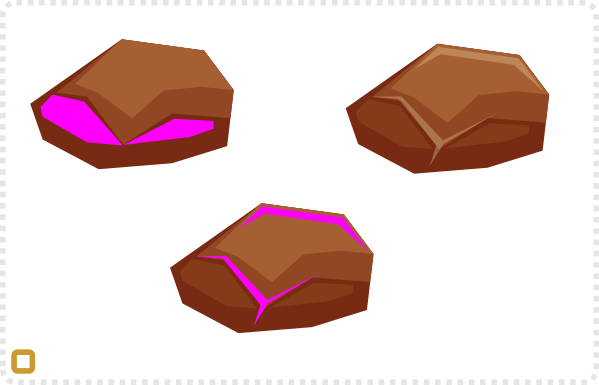
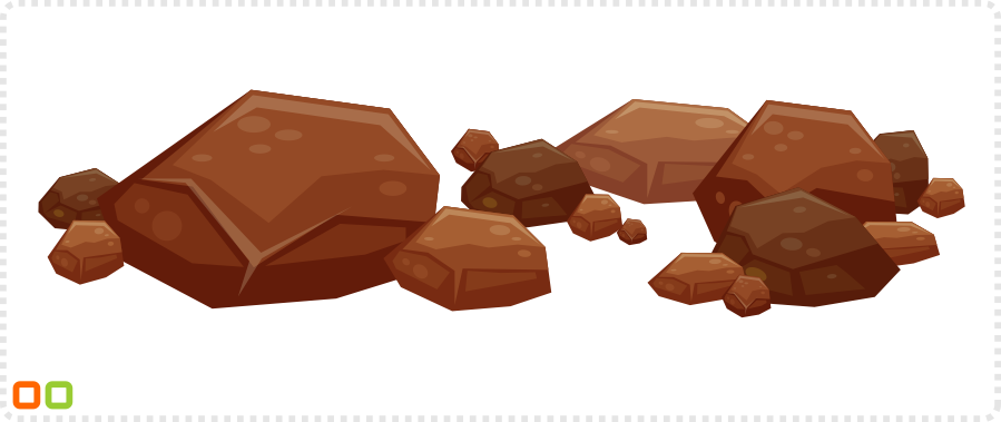
As with the rounded rock it’s all about variation. Copy your initial rock and modify it. Move elements, add or remove details, change the colours and the size.
Another way to shade the rock is by using less shapes for harsher edges.
Deform the inner shapes to form some roundness.
Adding another shadow shape to give the edge more depth.


Sharp Edged Stones and Rocks
This style gets shaded with a gradient. A shading colour is going from full colour to full transparency.
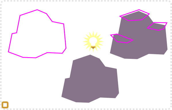
Nearly the same principle applies when creating more complex formations.
Using the straight line tool draw the rock shape and make a mental note about the light direction.
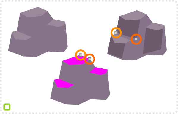
Still using the same tool add shapes that create to top of the rock.
Use a transparent gradient in the fill to hide the bottom edge of those shapes.
A duplicate of these shadow shapes creates another edge to the rock.
Additional shading might be needed to define cracks and gaps in the formation.
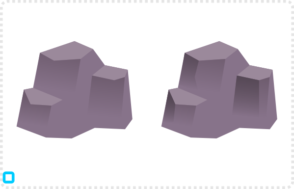
and some lines as veins to make it visually more interesting.
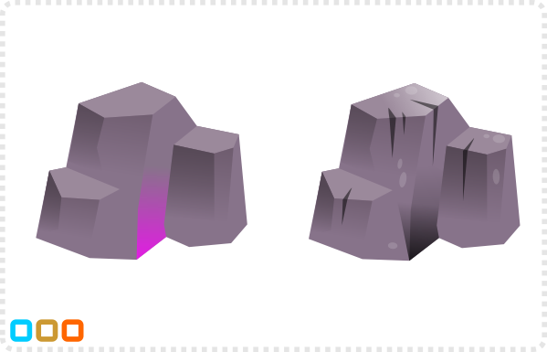
When creating a group of rock keep the direction of the light in mind.
Add detail like small cracks more highlight or texture to make it more interesting.
Putting all the variations [in this case just seven different shapes] together allows you to create interesting and unique rock combinations for your environment.
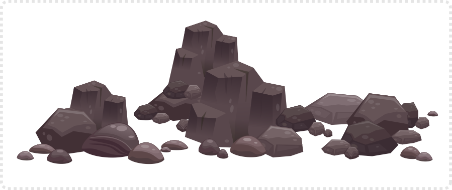
Shading Rocks and Stones Conclusion
I hope this tutorial on shading rocks and stones made sense. Ultimately, enough sense to enable you to create and shade rocks and stones on your own. Enjoy doing it, bend some vectors and have fun!
Get the source files [svg and pdf] for this tutorial for free!






Thanks Chris, this is awesome and exactly what I needed to get away from those dreaded pillows. You are a legend and this is by far the best site for anyone who wants to learn how to create game art. Cheers
Thanks, Pete… I am not sure about the legend bit… not feeling old, wise or mad enough for that… but I am glad my blog is helpful.
Can't get my rocks to look as nice as yours, really bums me out :/
Can you show me what you got done? I might be anle to point you in the right direction once I see where your problems are.
Two images I've uploaded:
https://imgur.com/7sFgwzS,yZDHEJA#0
I could upload actual files but that would require a hosting site for files.
It's hard to follow along when you can see the progress but not the specific steps. Thank you for any advice.
Thanks… I think you did a good job on those. The problem I see with image number one is the bottom of your rocks. Especially the white one on the right. The edge is very sharp, suggesting that the rock in sitting in something (e.g. sand, mud, etc) as it would be rounded if we saw the whole rock. If you place them on some background e.g. sand and give them a shadow, they should look rather nice. The second image is all about the colour differences. I would suggest just using a base colour and all other shapes are either white or black and you control the shading through opacity. More opacity will mean less contrast and will make the rock look more as one piece – rather than a 'layered cake'.
Please, make video tutorials.
your work is awesome !
Thanks… but it's not that easy… I will try… even though I have to admit that I am not a big fan of video tutorials… but there have been so many requests now…
//thanks//
Thanks for your great tutorials.
I started two weeks ago learning inkscape, and thanks to your tutorials I actually like my results.
https://i.imgur.com/1f3G95f.gifv
Awesome tutorials man. Cheers from Brazil!!